London based Farha & Associates is a boutique corporate law firm serving entrepreneurs and investors in London and from abroad.
The challenge
Reinvent an established and reputable brand to better communicate the key traits of the company and realign targeting to their primary market of technology entrepreneurs whom they help from ‘incorporation to exit’.
My role
Immersion Workshop Facilitator
Hands-on Creative Director
User Experience
WordPress site design and build
Various branding deliverables
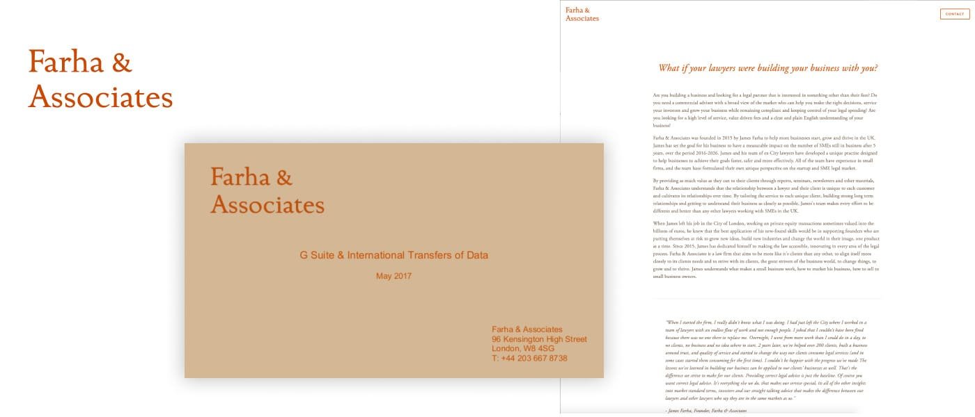
The old Farha identity didn’t align with what they stood for and what they offered clients.
During the Immersion phase Managing Partner James Farha was able to clearly describe the experience clients have with Farha Law. It’s a company that specialises in helping technology entrepreneurs go from ‘incorporation to exit’ so there is a true partnership that follows the relationship as it traverses the ups and downs of starting a new company.
There was a strong desire to communicate key traits of that real partnership. A combination of warmth, approachability melded with the professionalism and skill to get you from point A to B in the most frictionless way possible as well as a youthful, disruptor tone.
Farha wanted to stay far away from communicating complicated, cold or too corporate like some of their competitors do as you can see below.
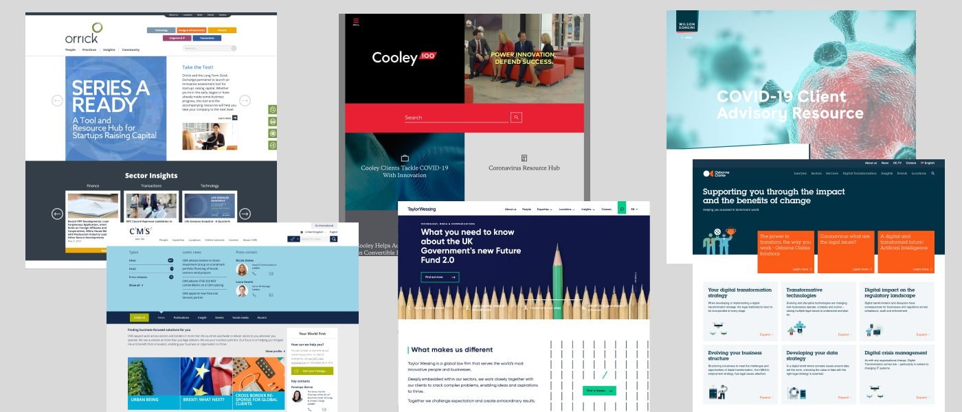
A collection of Farha’s competitors
The identity directions presented to James really captured the key traits he wanted to communicated with each element of the identity working together to create the story of Farha Law.
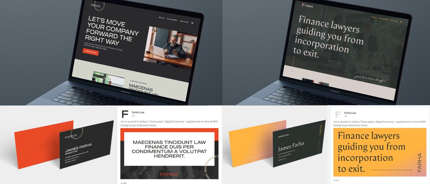
Every detail of the identity was thought through carefully to communicate to specific traits from the Immersion data and when put together all the details work together to tell the whole story of what Farha represents.
Farha identity details for the Modern Boutique direction.
I can’t speak highly enough of the process Seth has created. Collaborative, thoughtfully presented and amazing results.
James Farha, CEO
Farha identity details for the Modern Traditional Balance direction.
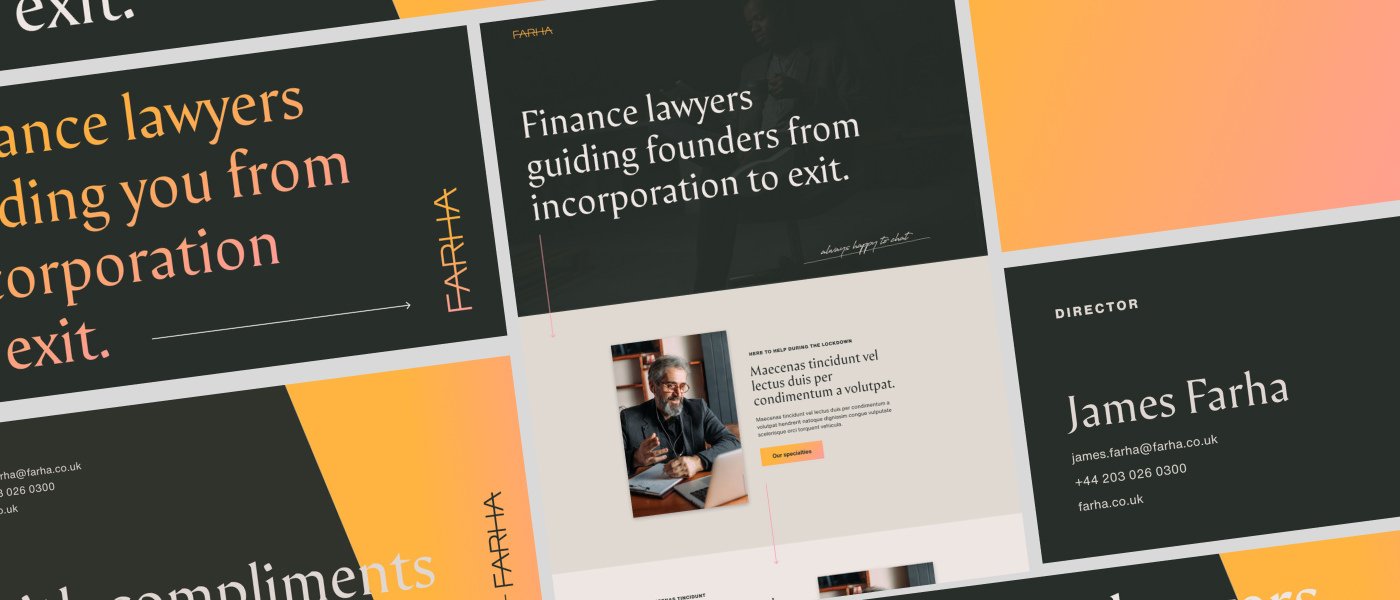
Working collaboratively with James and his wife Maria, we were able to narrow down an identity direction (above) that captured a forward thinking and approachable tone but it was decided at this point that it was best to tone down the disruptor tone just a little bit, which can be seen in the pink and yellow gradient.
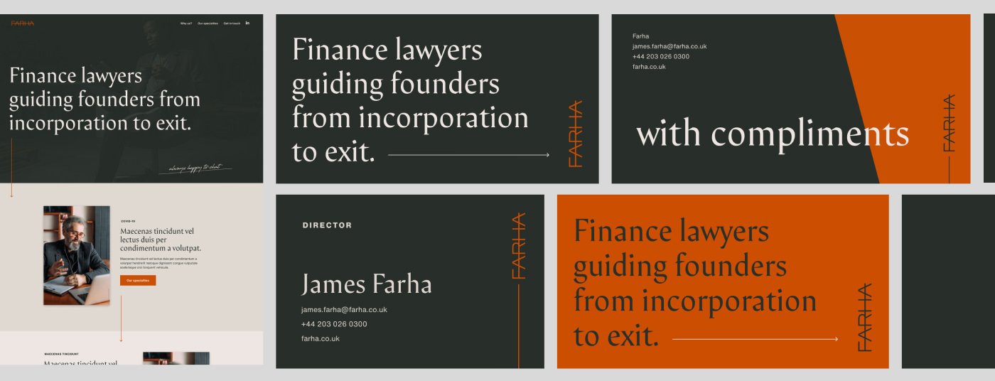
After a few discussions it was decided that we would use the original Farha orange to replace the more disruptor pink/yellow gradient. We still keep the warmth and approachability of the palette as well honouring the previous brand. Disruptor elements still exist in the identity but it’s now been toned down with the new palette.
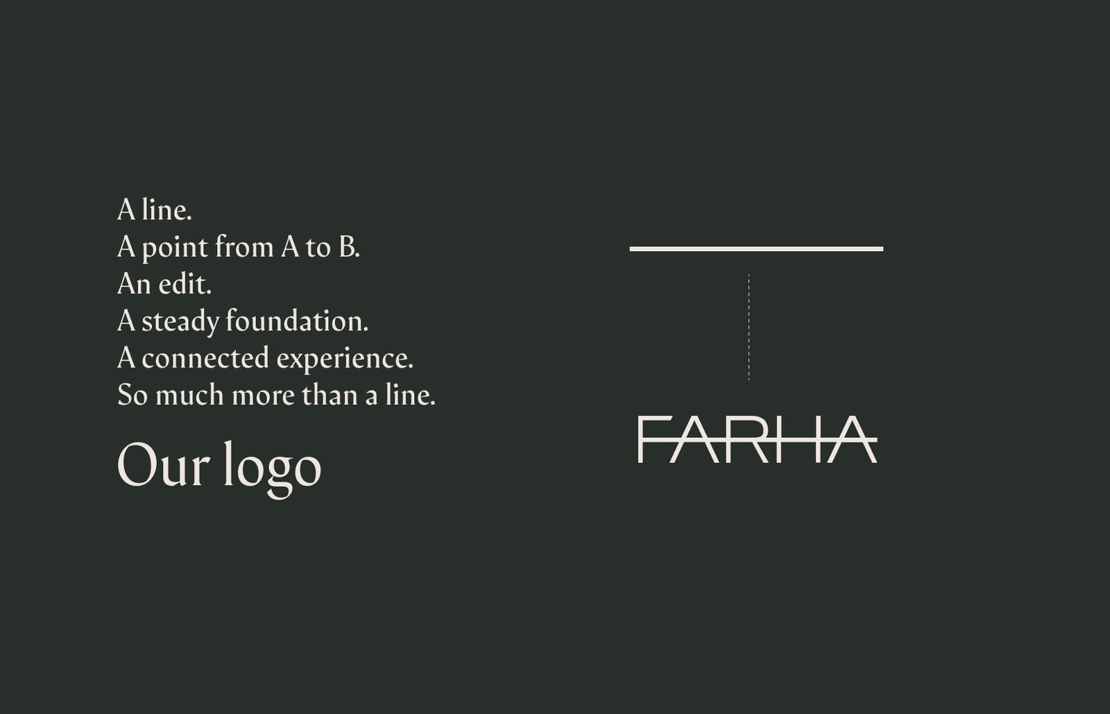
You can see below where the character traits started and ended up based on the iterations.

The Farha team couldn’t be happier with the results and I can’t thank Seth enough.
James Farha, CEO
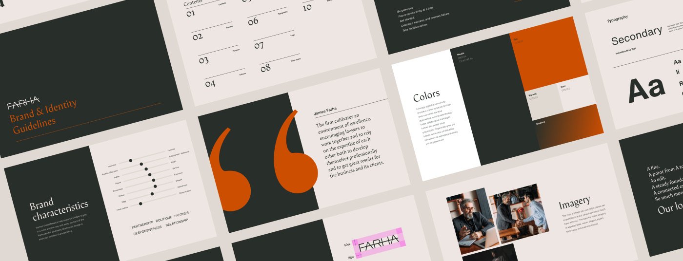
The final deliverables included the identity elements along with social media assets, print assets like business cards, comp slips and envelopes as well the under construction WordPress website experience. A brand guidelines PDF and Figma based brand guidelines come standard with any project.
DATE
Spring 2020


