Coaching & consulting with lightning speed growth & massive income breakthroughs built around your life.
The challenge
In this case the brand is a direct reflection of Sara herself so it was important that what people experienced online reflected the person they would be interacting with.
My role
Immersion Workshop Facilitator
Hands-on Creative Director
User Experience
WordPress site design and build
The old Sara Longoria identity failed to represent who Sara was and what she offered.
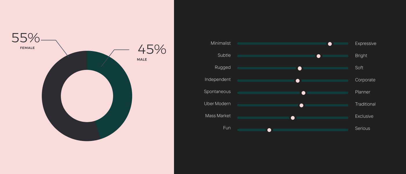
During the Immersion phase I worked together with Sara to really dig into the type of person she was and what it meant to interact with her during her coaching and consulting business. It’s important to learn every nuance of how the company works to better understand what customers will experience. I then researched her competitors and talked in-depth about about what type of customer Sara attracts now vs the type of customer she wants to attract and touching again on how Sara wanted them to feel throughout the Sara Longoria Coaching experience. Finally, we had long discussions on the type of personality Sara has and what bits of that she really wanted to play up in the identity to better target her customers. Every design detail going forward will be rooted to this Immersion phase output. It is by far the most important step of the process.
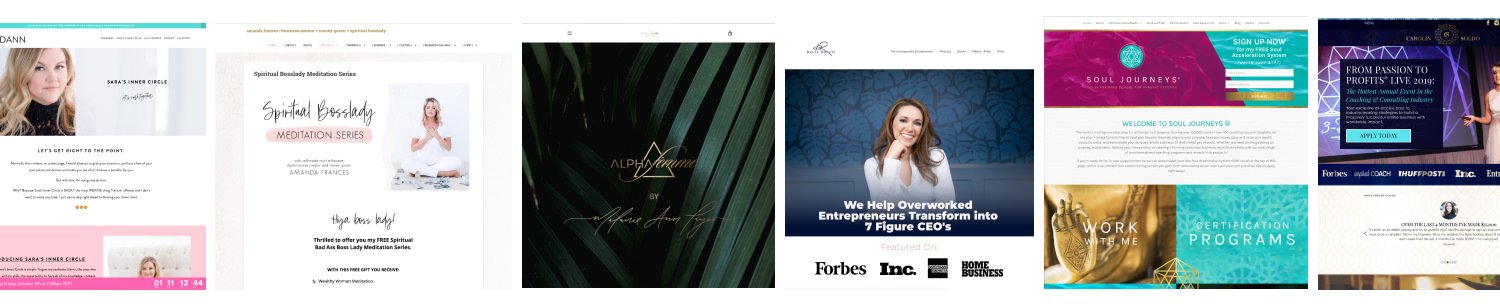
A collection of Sara’s competitors
Following the output of the immersion phase I created a few mood boards which would help narrow down the direction of the future Sara Longoria brand. Remember that at this stage these are merely tones to explore rather than exact designs.
One major key insights that emerged from the immersion phase was that Sara challenged her clients to dig deep into themselves. To go to those dark places that hold us back so you can move past them into the “light”. There’s a large part of Sara’s work that deals with the Psychology of unlocking a person’s potential and it’s not a one size fits all solution. It can be a more free-flowing process than a rigid outline to follow. That key insight would come to direct the main elements of the identity.
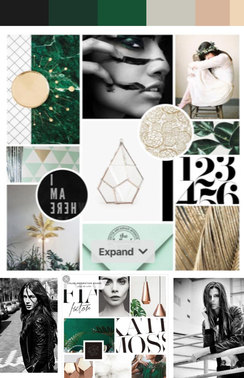
A natural, elegant and edgy tone.

A clean, bold and approachable tone.
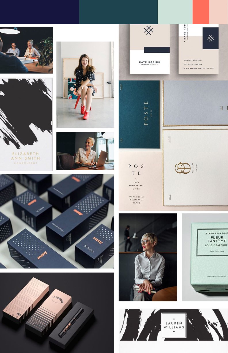
A sophisticated, approachable and mature tone.
The identity and design work Seth did for us perfectly captures who the Sara Longoria brand is.
Sara Longoria, CEO
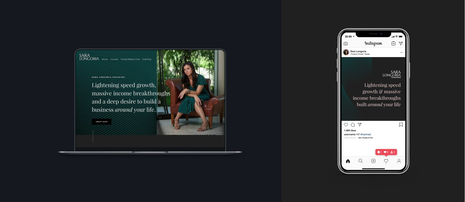
Fast forward a few steps and you can see the identity development above. A key element of the new Sara Longoria design language lies with the background textures.
Their shapes are fluid and organic to reflect that psychological process clients go through while working with Sara. The shapes are made of layers that condense to form a gradient from feeling heavy to light, which helps to communicate going from that darkness in one self to finding the light and unlocking their true potential.
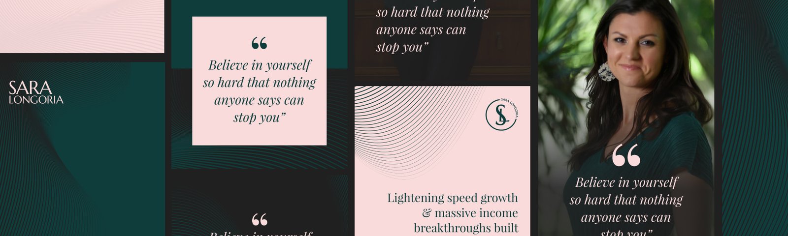
Every detail of the identity was considered to complement each other to form a visual language that communicates with confidence who Sara is as a person and what kind of business experience to expect when working with her. Every detail was directed by the Immersion workshop.


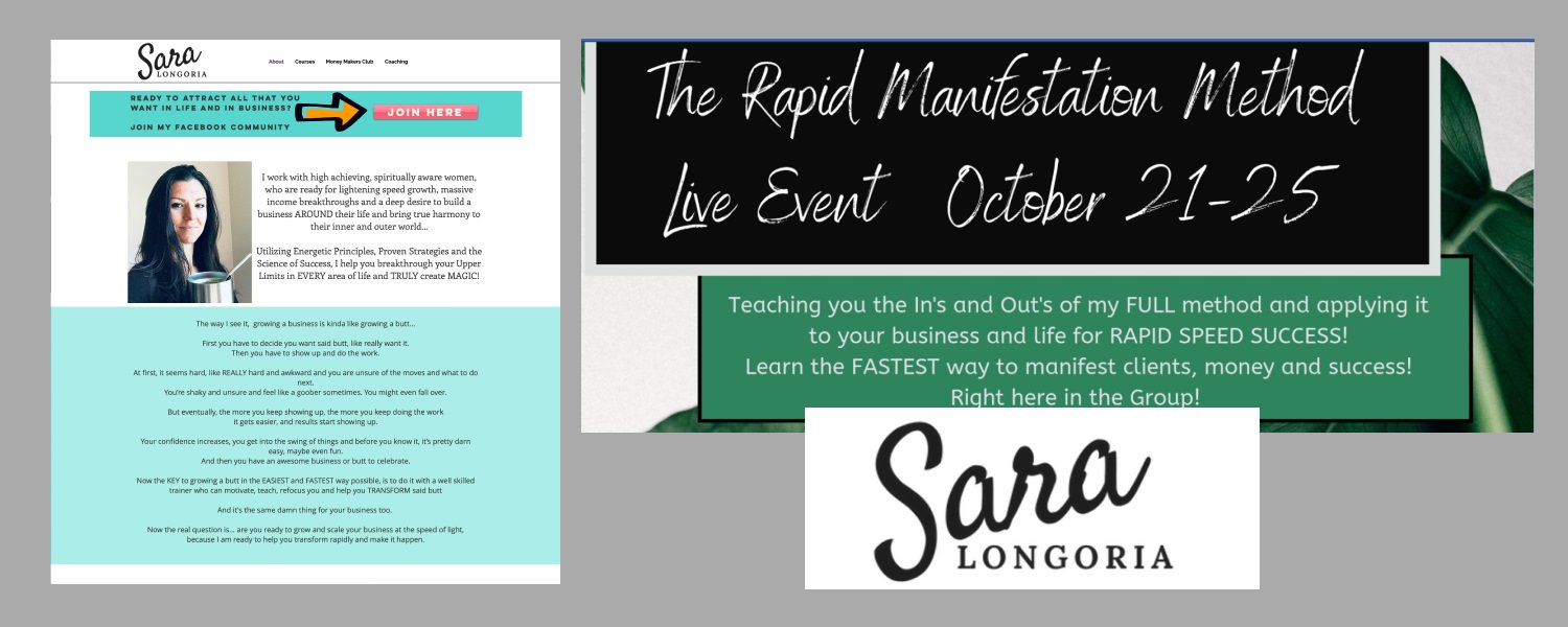
Confident and approachable photography softens the overall tone.

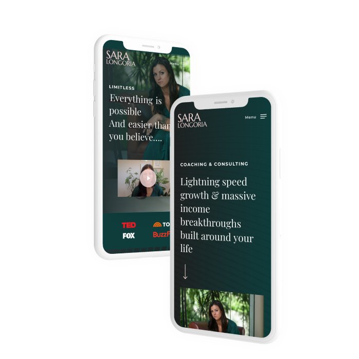
Elegant layouts help convey the professional tone of the brand.

Clean typography and large padding create a sense of space to reflect.

Testimonials pepper the site to reinforce the quality of service Sara offers.
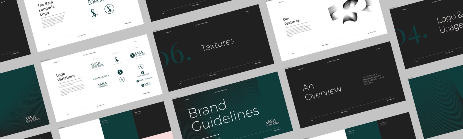
The final deliverables were a PDF and Figma based brand guidelines with an additional Design System Foundation file. Having both of these deliverables allows the Sara Longoria team easy access to important identity assets and guides on how to use them.
DATE
Late 2019