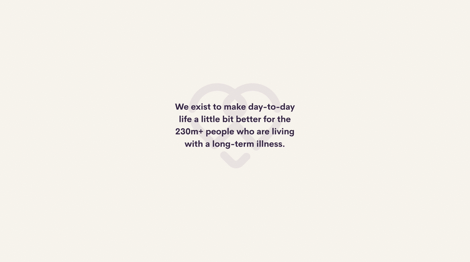
Here to make everyday living a little bit better for the millions of people living with long-term health conditions, all over the world.
The challenge
Fresh off new funding the LiveBetterWith team saw an opportunity to shift their brand experience from e-commerce to a more community led offering. The challenge was to transform a cold and medical tone to a welcoming, empathetic experience that encourages users to not only shop the useful products on offer but engage in the community.
My role
Core Workshop Facilitator
Art Direction
Brand identity
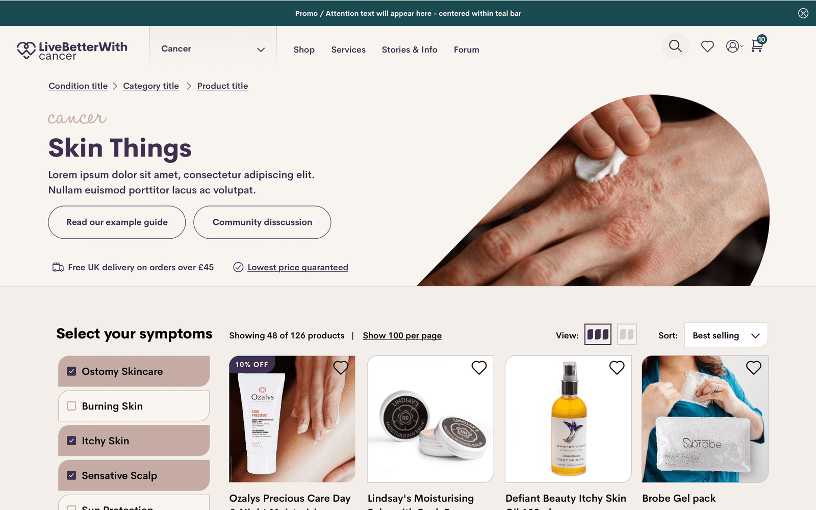
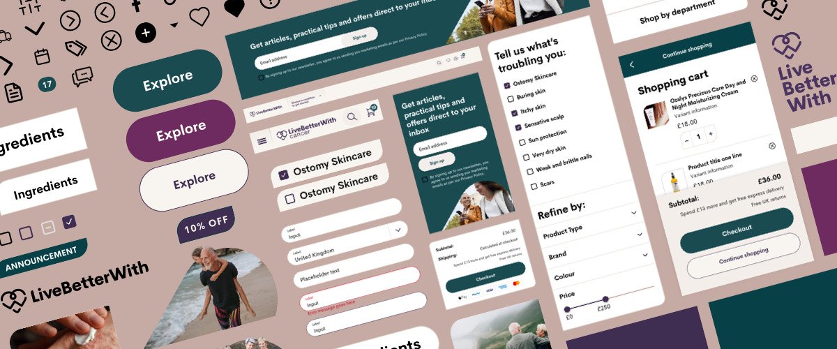
Responsive UI Design
Design System Foundation
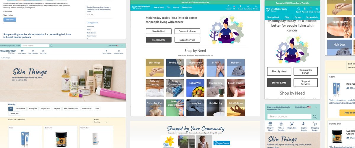
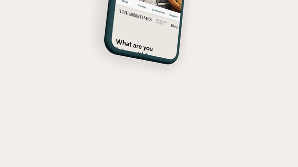
The old e-commerce led experience had an overall cold tone with no real consistent design language.
Getting to know a company down to its core is one of the most important aspects of creating a new brand experience. I helped lead a Core workshop to get to know the soul of LiveBetterWith. I ran activities to help tease out the important things that make up a company. Their purpose, values, attributes, who they want to target and how they want to be perceived by the world.
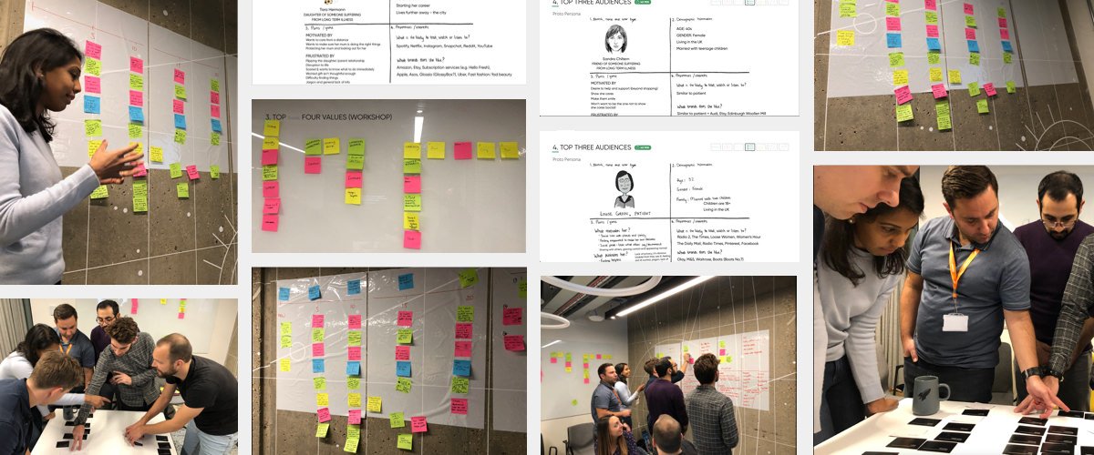
The Core workshop allows for quick in-depth knowledge of company while performed in a collaborative environment.
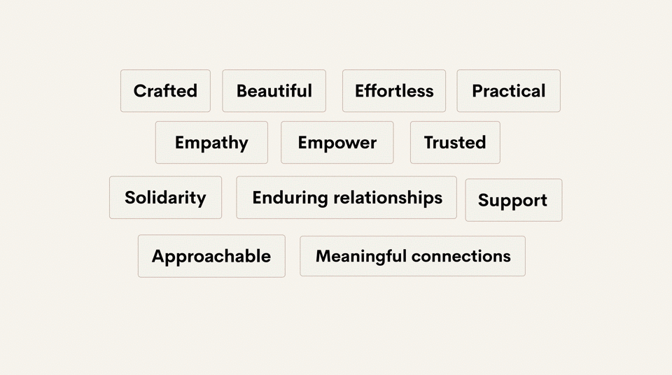
Brand attributes give companies human characteristics allowing a more authentic connection with users
With the Core workshop complete I was able to take the output and start creating creative directions for the new LiveBetterWith brand.
With regular presentations The LiveBetterWith team stayed close to the creative process. I first created mood boards then after feedback from the team created more contextual mood boards to get a better sense of how the direction tones could translate to real world uses.
Brand attributes mapped to mood boards

Brand attributes mapped to contextual mood boards after feedback
The identity and design work Seth did for us literally had us tearing up in the final presentation. He was able to perfectly capture who LBW wants to be.
Graham, Director, Product & Digital Customer Experience
I looked into every little detail of every identity element to make sure they complimented and strengthened the brand attributes.
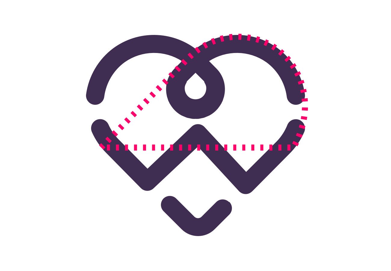
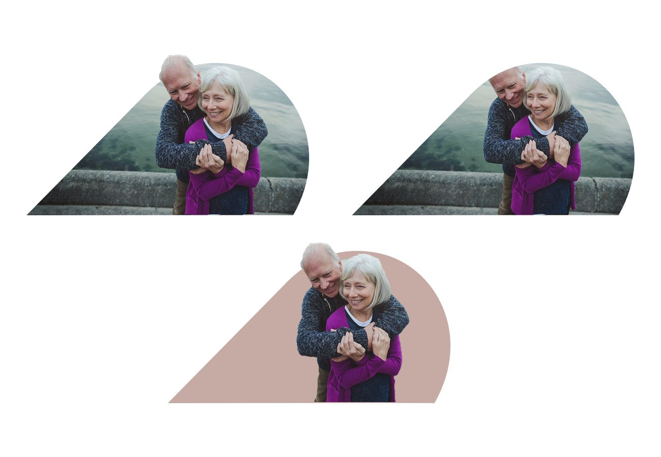
To visually communicate the feeling of Crafted I used specific typefaces that had flourishes of human personality while using the crop of the logo to create an engaging image mask that could scale in different treatments.
While this is just a taste of the type of detail and thought that went into each aspect of the new identity. Every decision had to map back to the data from Core workshop.
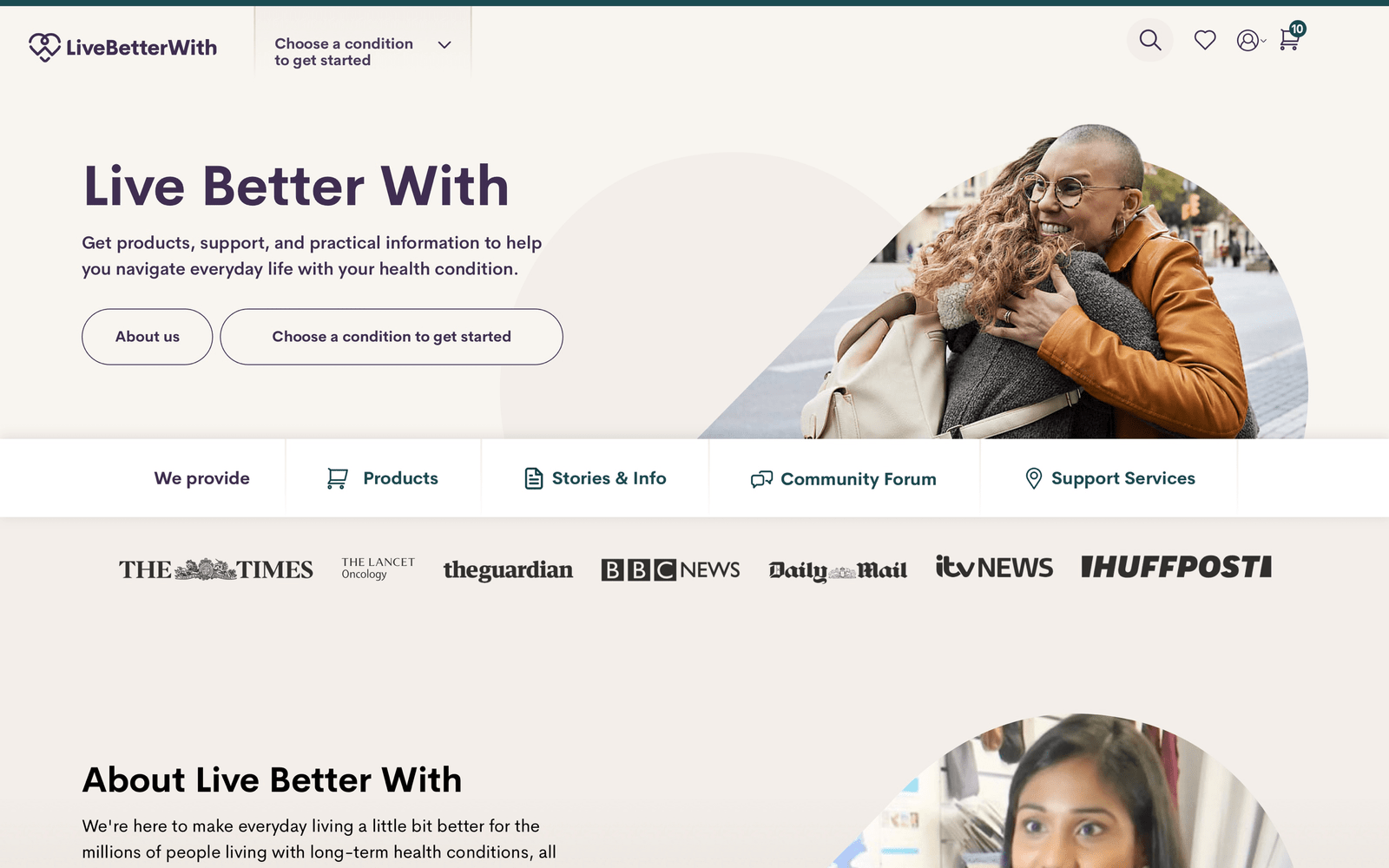
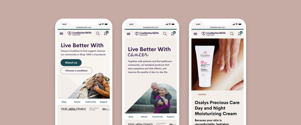
The new colour palette is warm and empathic with flourishes of strength.
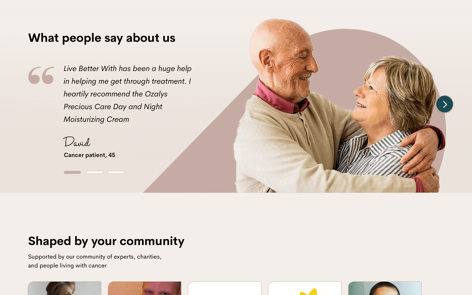
New image art direction helps show authentic human emotion
The crafted feel is consistent throughout

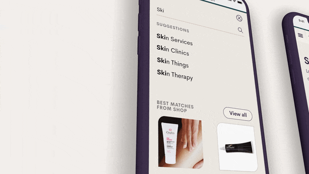
New product imagery styles help humanise the commerce side of LBW
One of the final deliverables was a useable Design system that allows the entire LBW team to stay aligned with new identity. The system keeps teams organised and allows them to use individual brand components as well as a reference point for brand colours, typography, logos and any other identity element.
Disclaimer
This project was created while employed at Forward Partners.